QuickCall
Reinventing branding to improve conversions and customer retention
Summary
Company: SRVR
Role: Lead UX Designer
Technologies Used: Illustrator, Sketch, Invision, Wordpress, HTML/CSS/Javascript/PHP
Project goals
- Emphasize app
- Make rates easy to find
- Reduce friction in the sign up process
Research methods
- Customer interviews
- Market analysis
- User testing
- Information architecture
Areas of focus
- What is important to you when deciding on an international carrier?
- What motivates customers to stay with your carrier?
- What are the most commonly used QuickCall features?
- What barriers exist when making international calls?
- What motivates customers to call internationally?
Core customer needs
- Low rates. Competition on rates is fierce and customers let us know that their biggest concern was cost.
- Usability of app. Though many customers decided to use QuickCall because of the rates, users were far more likely to remain customers if they used the app.
- Simplification of calling. International calling can be complicated, and users wanted to simplify the process.
- Clear and reliable service. The last thing that any caller wants is a dropped or garbled call.
Initial steps
QuickCall was refocusing it's efforts on the calling app because it greatly improved user satisfaction and those that used the service in combination with the app, were happier and called more frequently.
The voice
The new voice for QuickCall was to be fun, light-hearted, and personal. The existing site was much too formal and generic.
While domestic calling is used for many different aspects of life (business, setting appointments, personal, etc.), individuals making international calls is larger personal in nature. Customers were mainly calling family and friends and we needed to make the voice reflect that.
The logo
The logo needed to be reflective of the new direction and still be recognizable as the same company.
We removed the “.com” because that made the brand seem dated. Also, there were too many different things going on in the logo. It looked busy, yet directionless. The oblique “Quick” with the standard “Call” conflicted. The “Call” not also being oblique and having a different font and color created a visual stopping point in the center of the logo.
The font was unified and the logo overall was simplified. Using the same font and weight on the “Call” as we did on the “Quick” prevented the visual stop, and reducing the number of graphic elements made the logo more cohesive.
Brand Colors
With the new direction in the voice, it was important for the brand colors to represent that change. So, instead of the darker, heavy colors that the brand was using, I gave it a new palette with brighter, happier colors while still staying close to the original hues.
Captain QuickCall
Then came the most fun part of the project, Captain QuickCall. After surveying customers and potential customers, we discovered that the biggest “enemy” of affordable international calling was calling cards. They promised cheap rates, but when actually tested an compared, you only got a fraction of the promised value due to fees and connection charges.
So, how do you defeat an “enemy” like that? You create a superhero of course. One that would battle the evil calling card companies and bring true value to the customers. This idea was pitched and the team got the go ahead to test out the response. A test web comic was created, which I got to do all of the animation for, and pushed it to all of the social media channels. What we got was an overwhelmingly positive response.

With the positive feedback we received, we started releasing regular updates to Captain QuickCall’s adventures on social media. This increased user engagement significantly and for the first time, we started seeing users sharing the content. The boring international calling posts were no more. Now, we had exciting, engaging, and shareable content that was driving users to the site. I even was able to have a little fun and create a small web comic for him.
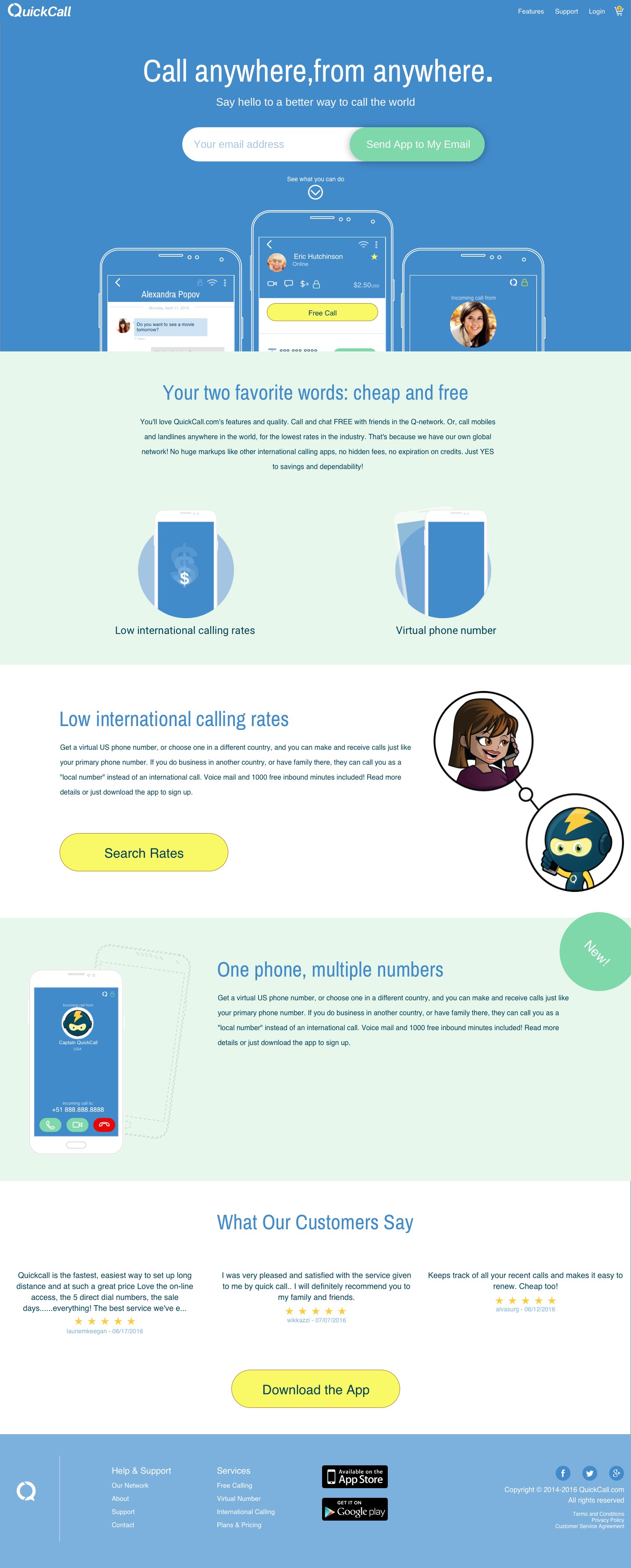
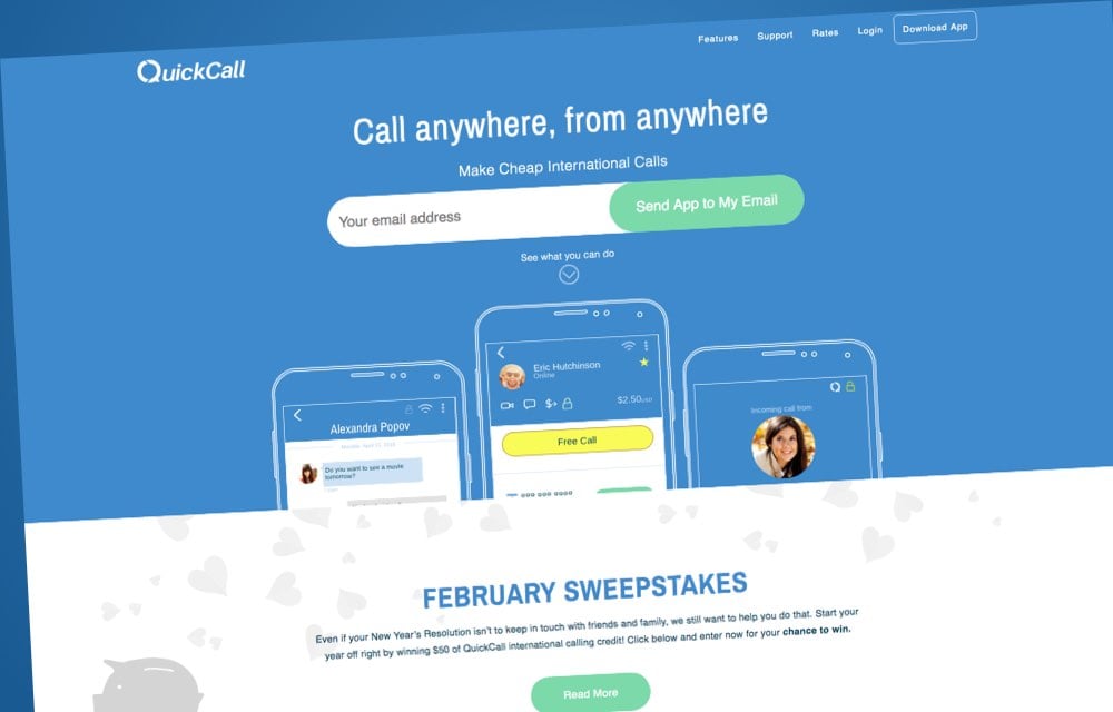
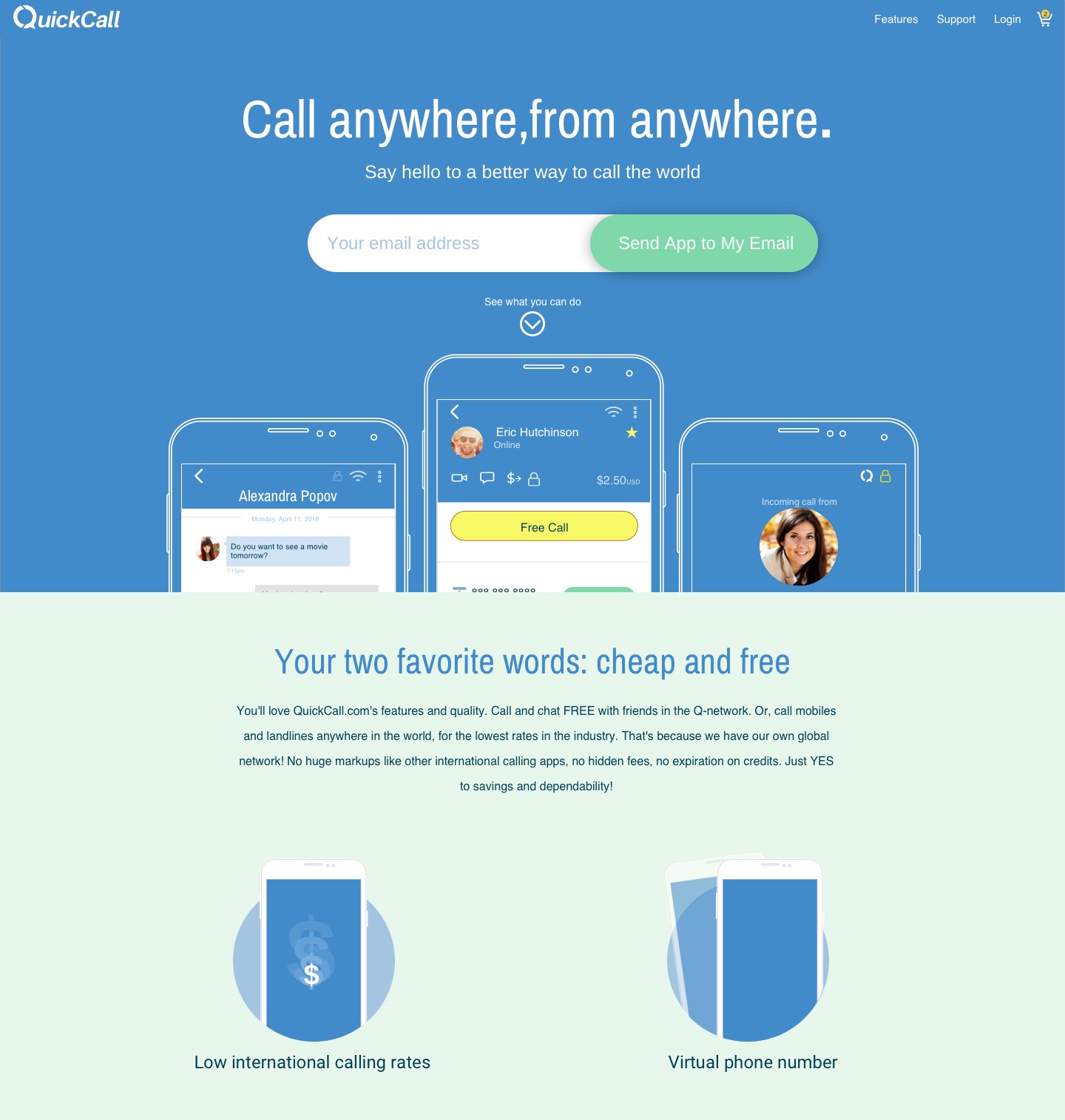
The website
Analyzing customer behaviour
Not only did customers spend more money calling internationally when using the app, but with the app's major UX changes, it was quickly becoming obvious that customers were happier with the service as a whole. Having spent some time promoting a new, friendlier, more light-hearted voice to the company, it was time for the website to do the same.
We were getting positive feedback from all of these efforts, so it was now time to really push it as the company identity.
The Challenge
When interviewed, most customers told us that the biggest deciding factor for them was the calling rate. However, while this was a large factor in the initial decision to purchase, it wasn’t what kept customers around. Trying to always be the lowest rate was difficult and if the only thing keeping the customers with the company was the calling rate, then they would bounce to another company the moment the competition had a lower rate.
The challenge for the website then was to push users to the app. As it was, users were signing up on the site, but many never got to the app.
The other challenge was that a customer needed to be able to start the signup process on the website and finish it on the app and vice versa.
Devising a plan
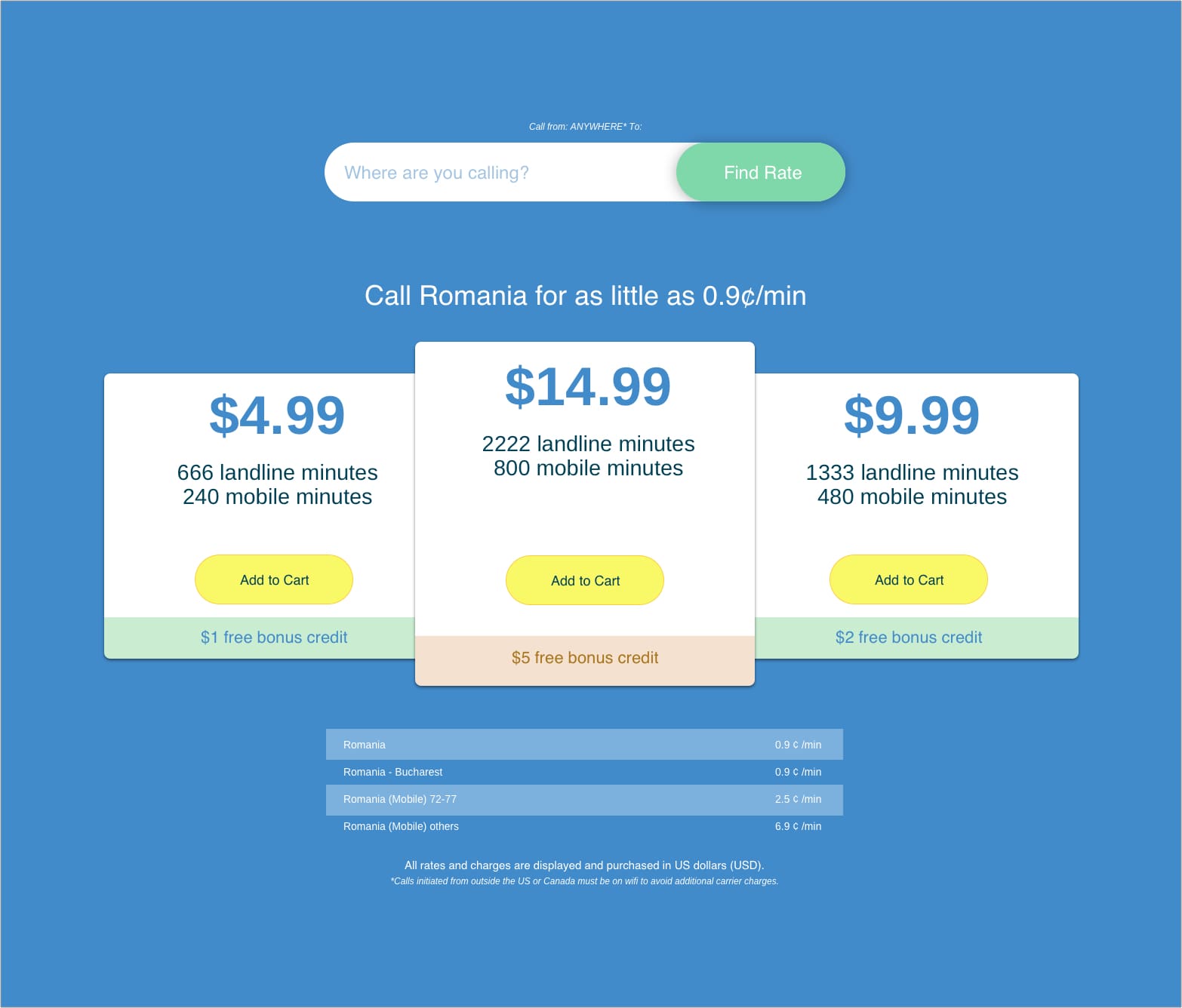
With all of the data, the decision was to push the app primarily, but to make it easy to find the current rates.
The new branding and voice were to be applied as well with Captain QuickCall taking center stage.
The solution
How do you get people to the app as fast as possible? You put an input to text the app link directly to the users' phones. This made it perfectly simple for those on desktop. For users viewing the site from their phone, I swapped out the form for buttons that linked directly to the the app store.
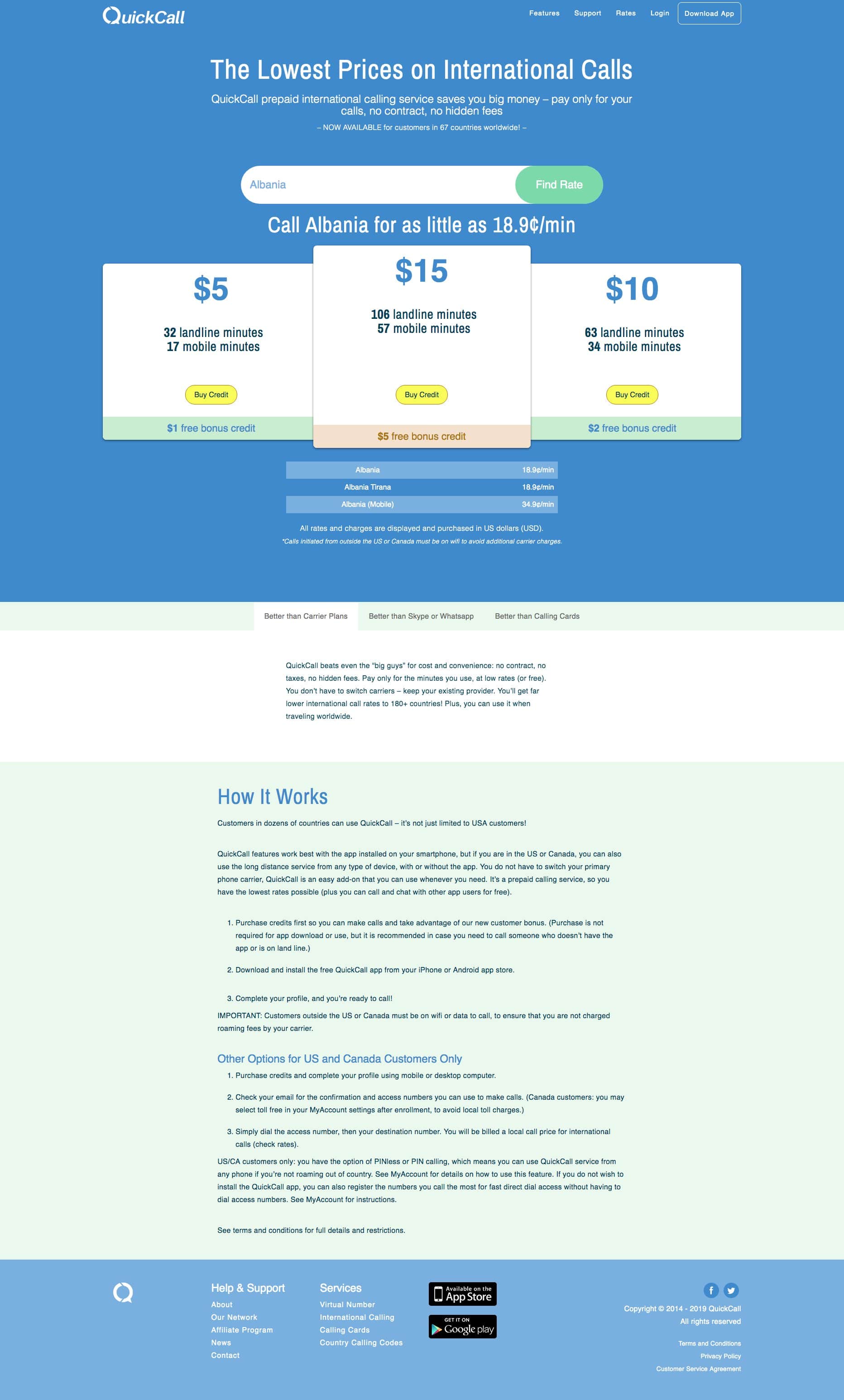
Rates were still very simple to find and navigate as well.
The signup process was unified with the app so that a user could start the process on one and finish on the other.
Result
QuickCall saw a steady increase in app downloads and paying customers. The biggest win, however, was that instead of about 25% of customers using the app, we saw a jump to 60% of customers downloading and using the app. Many of whom started on the website and downloaded the app to sign up. There was also a 350% increase in paying customers due to the new sign up flow.
This was, of course, not solely my effort, but the efforts of a great team that worked together, communicated well, and pushed to create the best possible experience.