QuickCall Calling App
Improving calling experience and customer satisfaction through design
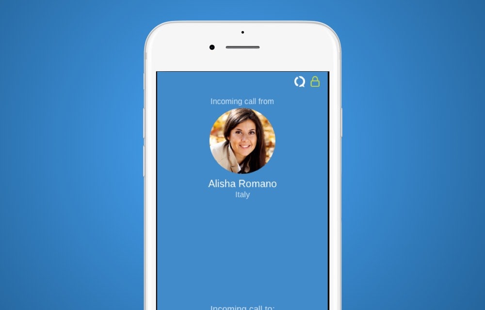
Summary
Company: SRVR
Role: UX/UI Designer
Task: Reinvent the app in order to increase purchase of calling credits and overall usability as well as tie into the new branding.
Technologies Used: Sketch, Invision
Project goals
- Increase customer calling
- Make it easier for customers to know how much call their money will buy
- Make connecting with other QuickCall users easier
Research methods
- Customer interviews
- Market analysis
- User testing
- Information architecture
The challenge
Reinvent the app in order to increase purchase of calling credits and overall usability as well as tie into the new branding.
The existing interface had been dropped then picked up by several different developers with no design lead so the end result felt like it was patched together and the experience from Android to iOS was drastically different. It was my responsibility to unify the UI/UX yet still make them feel natural to their environments.
It was also difficult for customers to know how much credit they had. Did they have enough to make the call? How long would they be able to call with their available credit? It was very frustrating for customers to be cut off halfway through a call because their credit ran out.
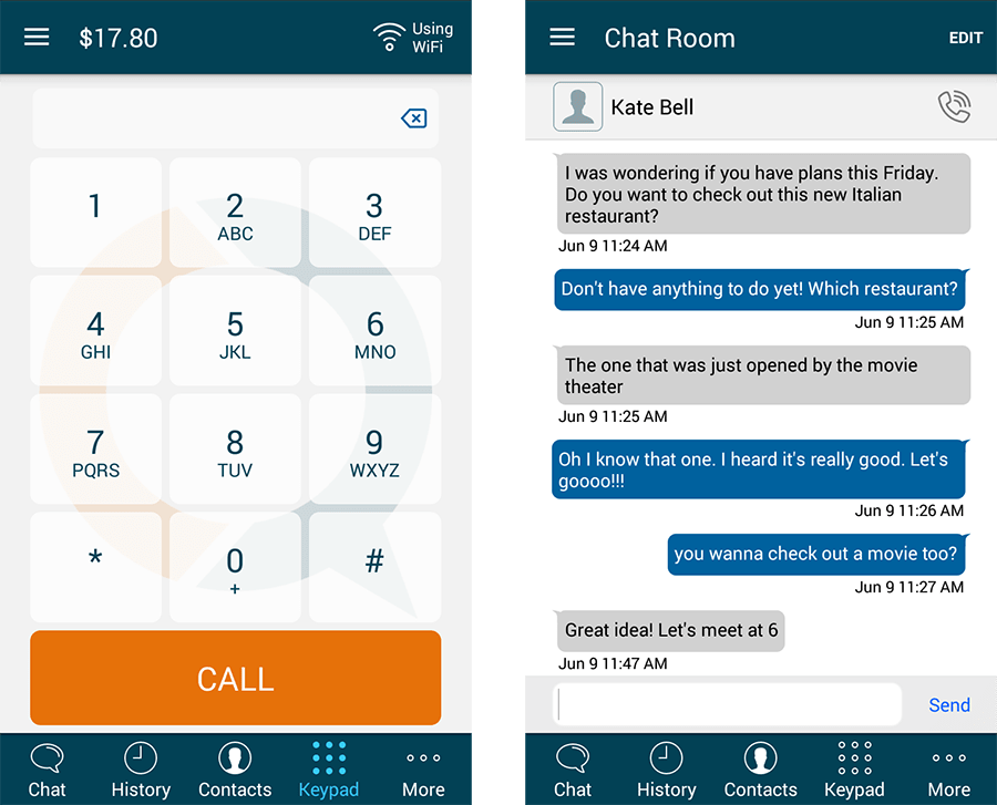
The process
User testing
User testing proved to be a great resource of information about the issues with the app. I found that on-boarding was easy, but how to call the correct way was difficult to understand and how to buy credit wasn’t clear.
Usage data
The usage data backed up what the user testing revealed. There were a lot of app installs and initial usage, but very few payments through the app.
Problem solving
Calling internationally is complicated. Why is it complicated?
- Country codes
- Calling codes
- Access numbers
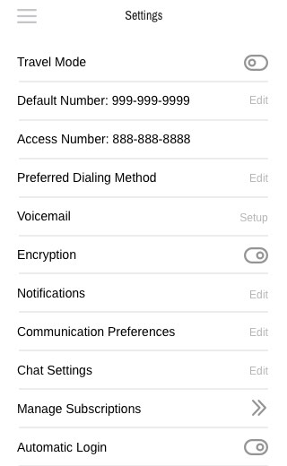
That's a lot of numbers to remember. So, numbers that were repeatedly used were added automatically in the settings of the app.
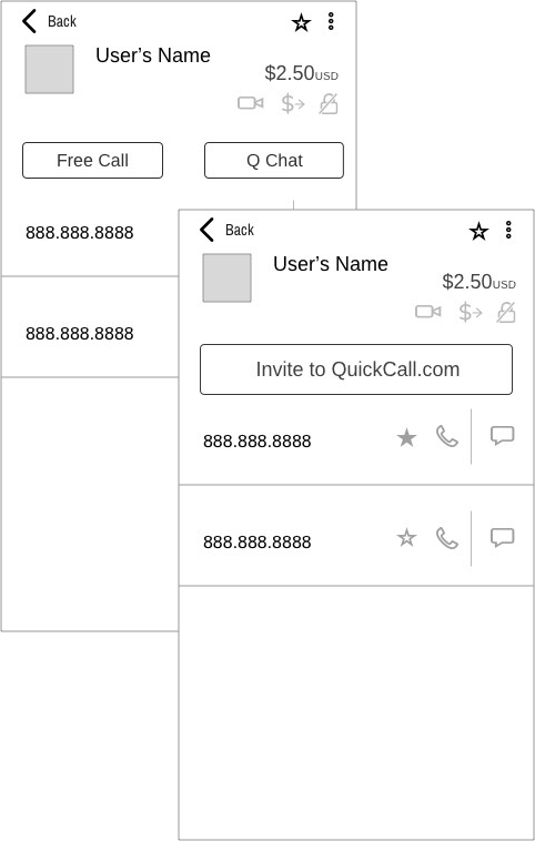
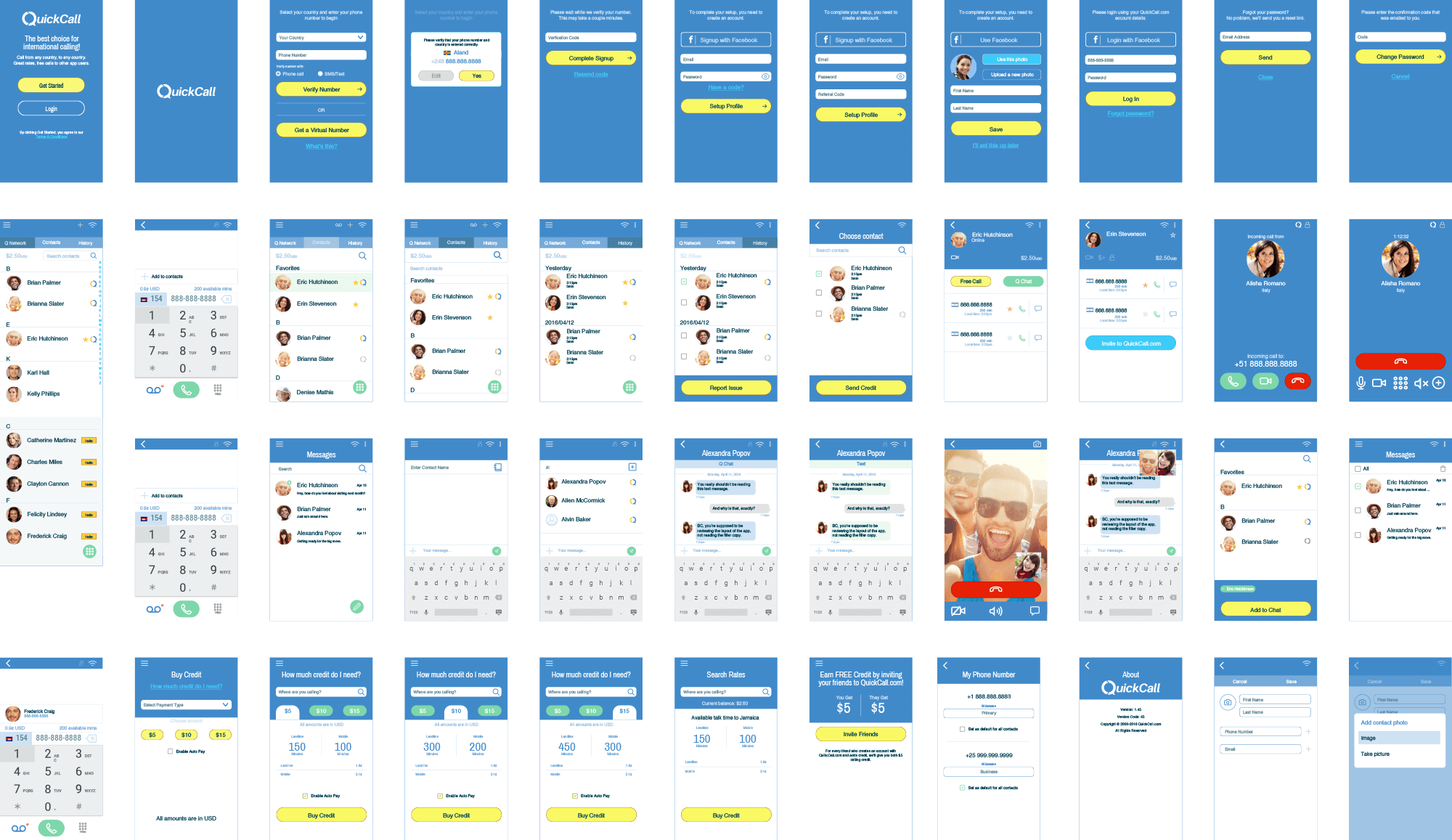
Initial wireframes were built with buttons for simple inviting contacts to use the app as well to reduce call costs for customers. Account balance was added to the contacts list. The later iterations would include call time available based on current balance for each contact number which would make it even more user friendly.
The solution
Along with many other updates, I made the buy credits more prominent throughout the app, as well as showing the user exactly how much money they would have to call a contact and how many minutes that money would give them. This solved the “unknown credits” issue and made the status of the users’ accounts much more transparent.
Clear display of account balance as well as the number of minutes that they could call a particular number in the contact details screen, combined with the ability to call other QC users for free gave users more confidence in calling.
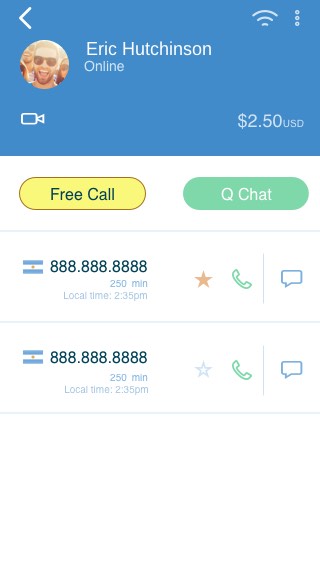
Making it easier and more rewarding to invite your friends to use the app. You get credit, they get credit, and when you call them through QuickCall, your calls are free. What do they have to lose.

Result
QuickCall received a substantial increase in user interaction and early testing indicated that users were more satisfied with the app which would result in increased usage and retention.
