Christian Yoke Dating Website

Summary
Company: Christian Yoke
Role: UX/UI Designer
Task: Create a modern, usable dating site design.
Technologies Used: Sketch, Invision, Illustrator
Project overview
Building on the success of a more niche dating site, the idea for Christian Yoke was to be a competitor to Christian Mingle with a strong focus on the social aspect.
The Challenge
Making a dating that was as much a dating site as a social platform created a certain complexity to the project. It needed to feel as natural to use as a dating site as it would a social media site.
Wireframing
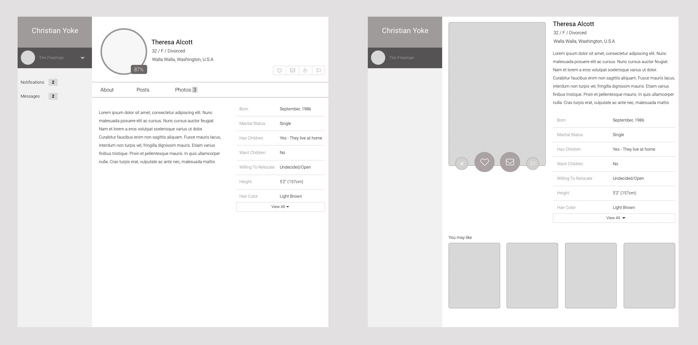
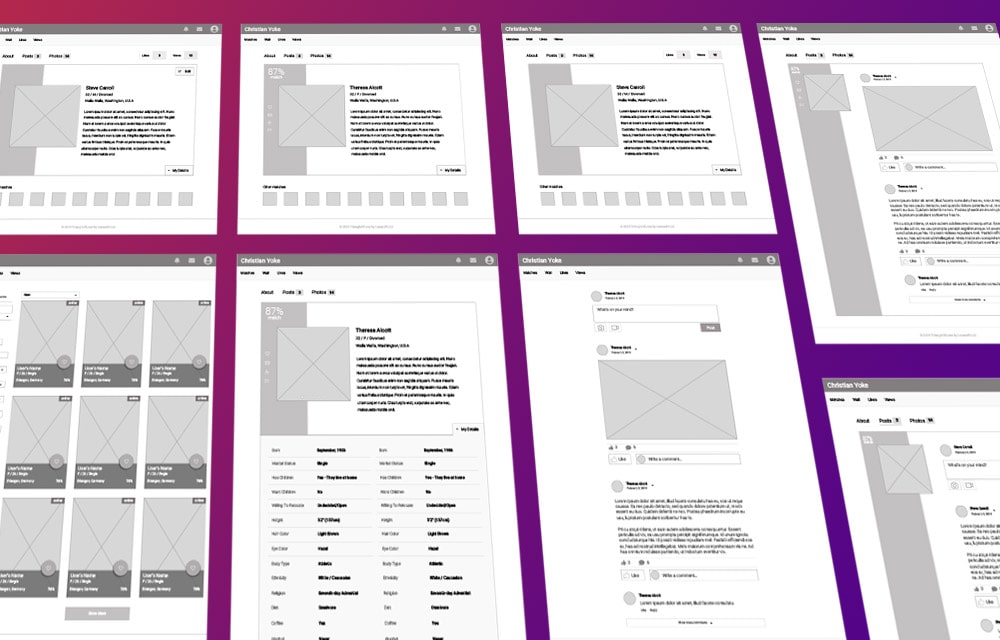
Initial wireframes quickly showed how easy it was to neglect either the dating or social aspect of the site. Early concepts were quickly discarded because they didn’t strike a proper balance.
It became apparent in these initial concepts that even though this site needed to balance the social interaction on a larger scale with the dating aspect, the primary interest of users was the dating aspect, so putting too much emphasis on the users wall updates was a mistake.
The solution
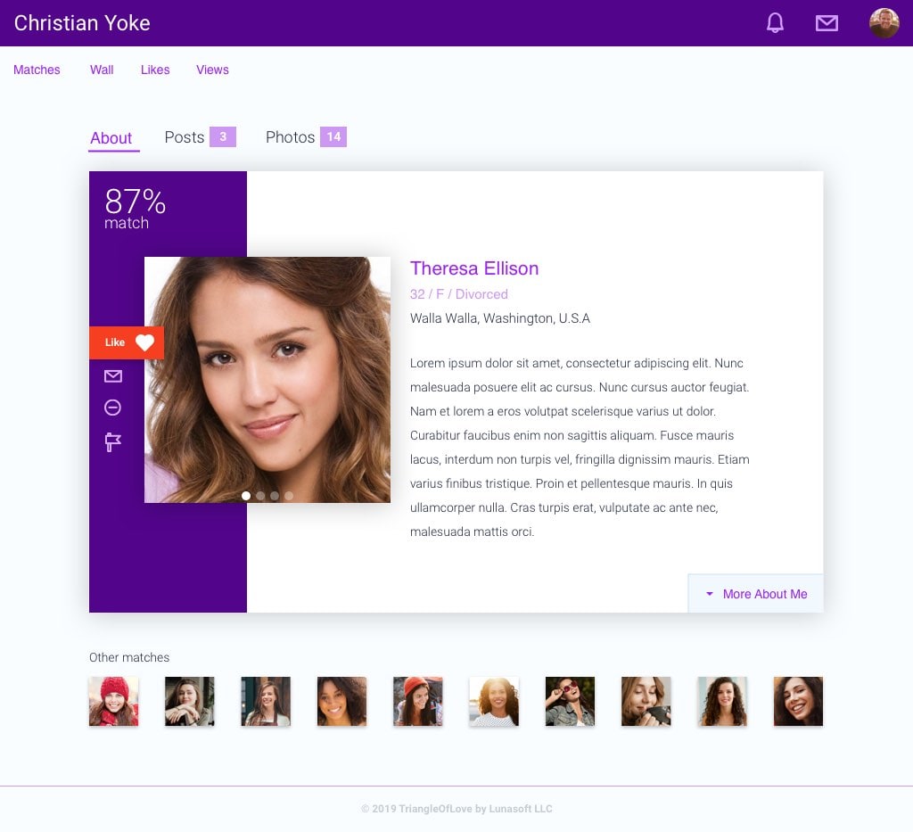
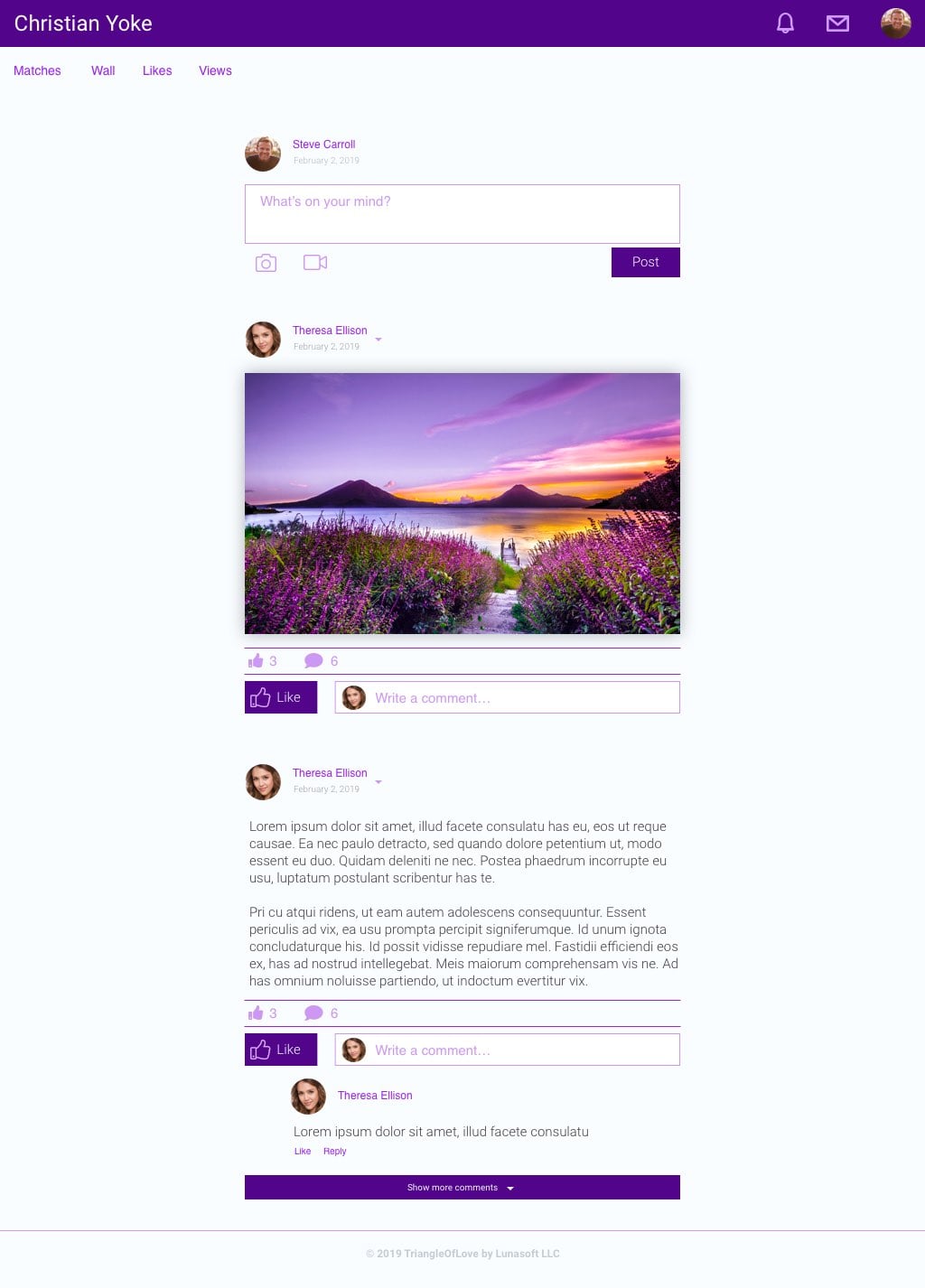
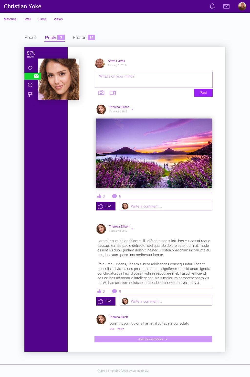
The end solution was a concept that would be similar to the feeling of a Facebook page, but with the profile out in front and necessary dating interactions first. This gave a more natural feel to the entire site and made it much more intuitive.
