BlueTone Account Interface
Summary
Company: SRVR
Role: UX Designer
Task: Update a bloated account interface to make it more user friendly and encourage customers to take advantage of useful features.
Technologies Used: Sketch, HTML, CSS, Javascript
The Challenge
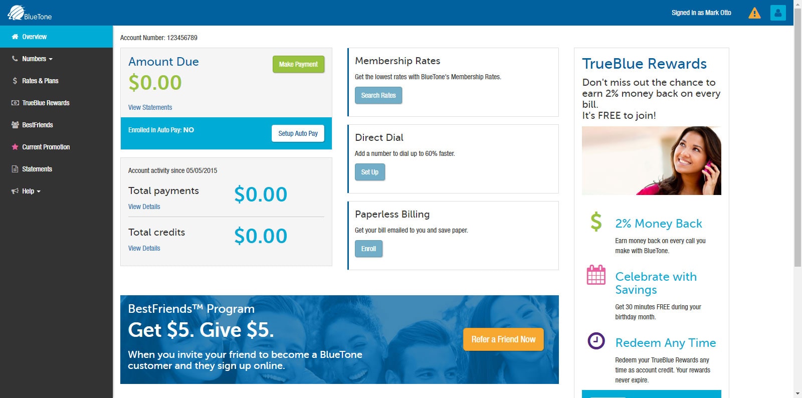
With an outdated and bloated account interface, customers were getting frustrated. They were unable to find where to enable crucial services, or get important data. To top it all off, the site was not responsive but rather had a duplicate mobile version. This made it difficult to maintain, requiring duplicate work. Ultimately, this was resulting in upset customers, and irritated employees. It was time for an upgrade.
Getting to know the customer
Before solving the customers’ problem, I had to understand the customer. To do so, I went collected demographic information, geographical information, and got feedback from customer service representatives about particular pain points for the customers.
Taking this information, I built some personas and verified those personas with the marketing team to ensure I fully understood the target customer. Once I felt I had a firm understanding of the customer, I was confident that I could begin the process of solving their problems.
Taking the pain out of account management
Telecom is a utility and is typically not flashy or exciting, let alone managing your telecom account. It’s something that all customers have to deal with, so why not make it easier and more intuitive?
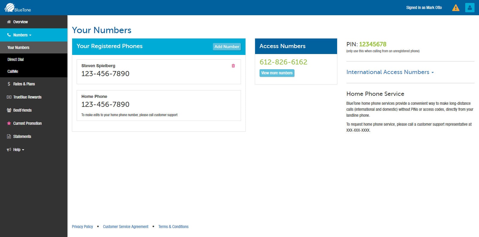
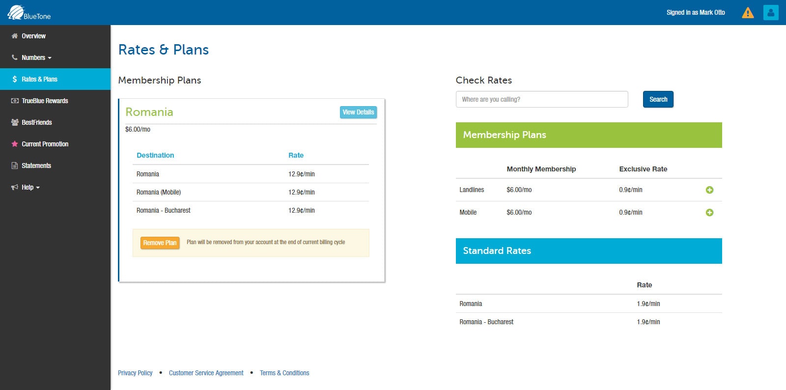
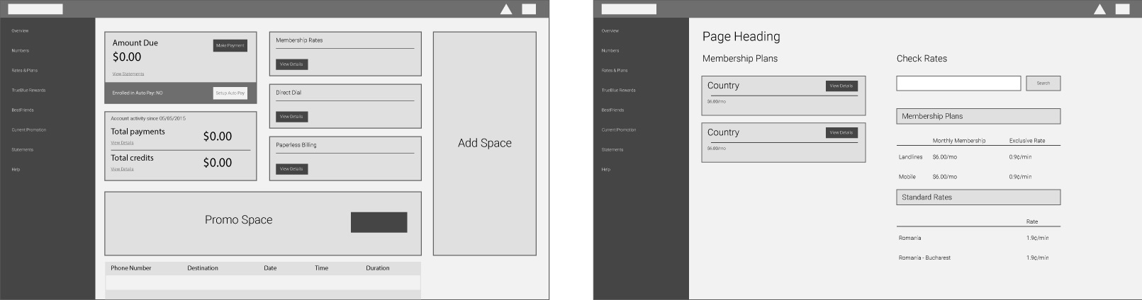
In order to remove the pain and frustration of paying money out for international calling (snooze), I developed an interface concept that would allow for easy access to all commonly used sections as well as had room for any special promotions and other money/time saving features. This would help to improve customer retention because they no longer needed to muddle through multiple pages to find what they needed. And, the the experience would be virtually identical on any device, further reducing frustration.
The solution
The company already had a brand style guide which helped to direct the style choices for the interface, but special UI styles needed to be established. Building from the existing styles, I created a color and typeface hierarchy as well as established an icon and pattern style.
All of this was done with a vision of future growth or UI expansion. Developing a style guide aided in future development and creation of any needed modules.
The final result was a fully responsive interface that removed the need for maintaining a separate mobile UI, and made it easy to find necessary sections while still advertising features and promotions.