Brawl Street App
Summary
Company: Brawl Street
Role: Product Designer
Task: Develop user flow and interface prototype for a stock trading game.
Technologies Used: Sketch, Invision
Project overview
Brawl Street was an stock trading game concept similar to fantasy football that would allow users to play as if they were trading on the stock market in real-time. It would incorporate real stock market feed and have a heavy social aspect to encourage friend referrals in the app.
My homework
This game would be similar to the way that fantasy league games are set up, though would be adapted for the stock market. With that in mind, I started researching the flows and designs of those kind of games. I also looked into stock trading apps as this game would bridge between those two types of experiences. This helped me begin to mentally establish how the game would function and users would interact with it.
Devising a plan
Because this was the client's first time developing anything like this, functional requirements were a bit sparse and needed to be fleshed out. I worked with them to understand everything that they needed and develop userflows and architecture.

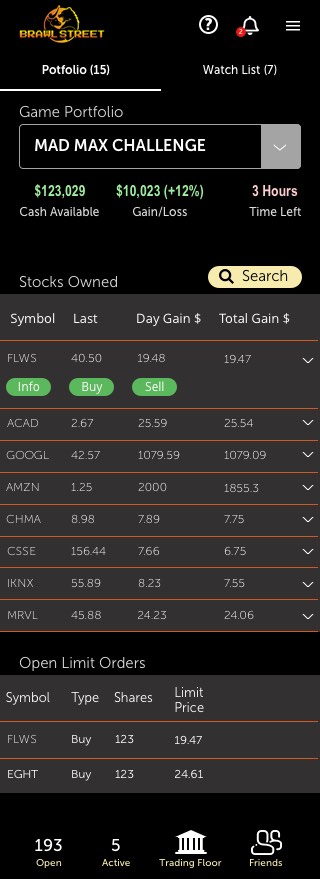
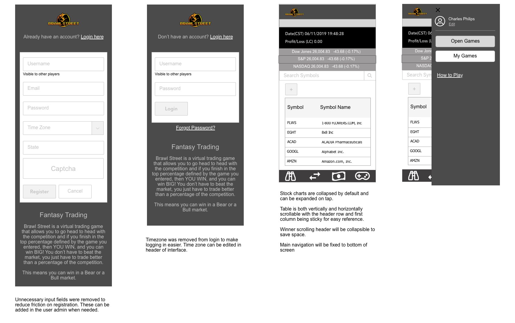
Using the finalized flows and functional specs, I began to build out the wireframes. The key here was breaking up lots of information into bite sized chunks. With the stock market, a lot of information is necessary to make good investment decisions (even if it is with pretend money). Add to that, sharing and multiple, concurrent games and a user could easily get information overload.
All of this made it critical that I spent significant time designing and user testing low-fidelity prototypes to get this just right.
Developing a style
A number of design styles were tested to get a sense of the atmosphere of the game. Because the logo had a retro feel, I started off with a toned down retro feel to the UI and worked on several drastic variants. These were then submitted for review to gather impressions from potential users.
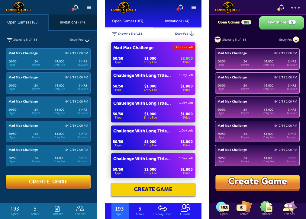
Ultimately, the feedback that we got was for a more sophisticated look.
The solution
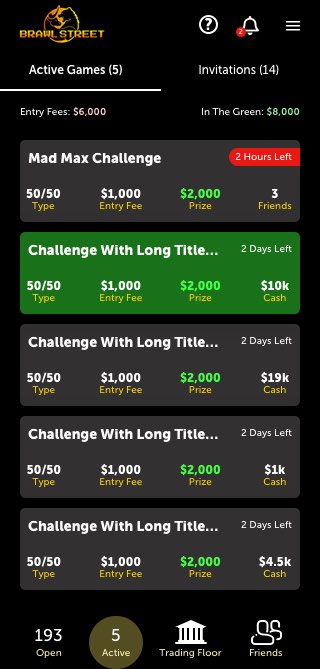
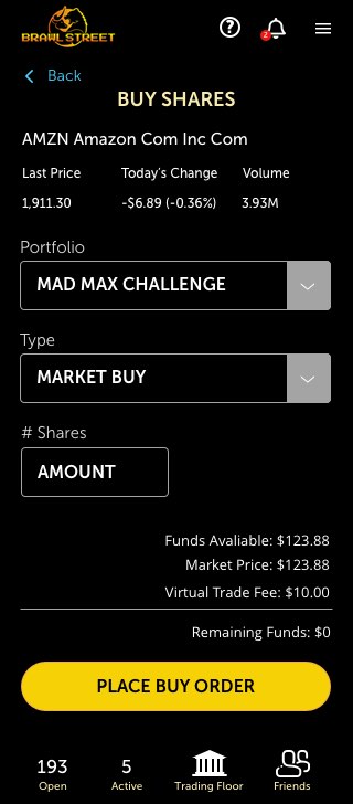
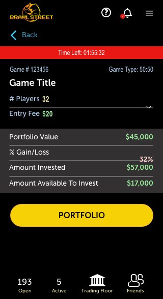
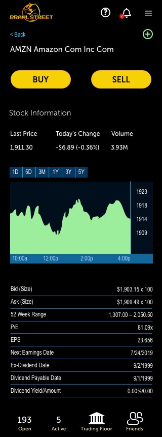
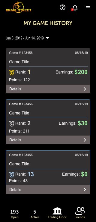
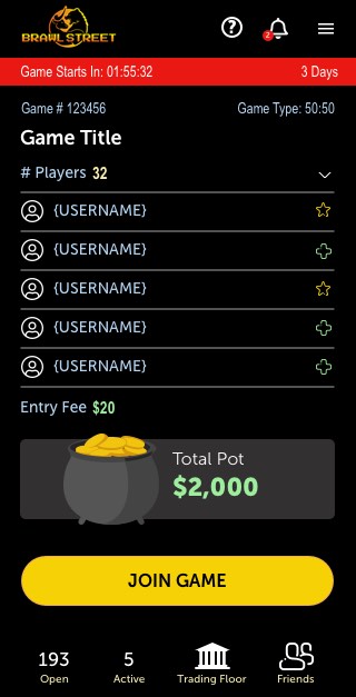
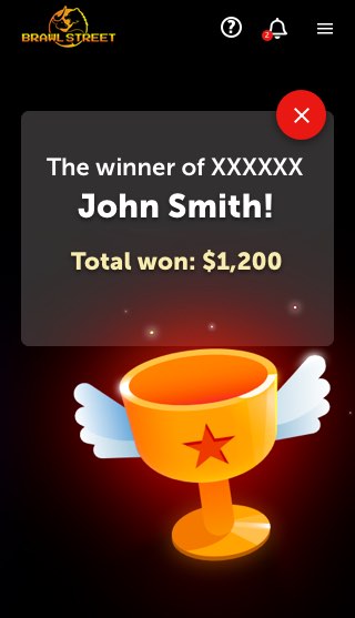
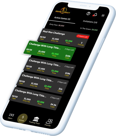
The final result was a more sophisticated UI that didn't lose the fun factor; bridging the gap between game and stock trading app.
