Block 6 Analytics Interface
Summary
Company: Block 6 Analytics
Role: UX/UI Designer
Task: Convert a bulky, difficult to use interface into a clean, easy-to-use admin that makes the most important information easy to find.
Technologies Used: Sketch, Invision
Project overview
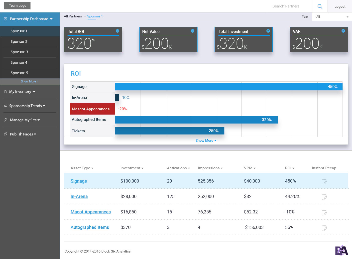
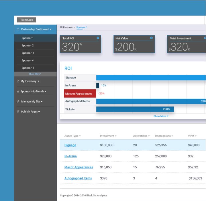
Block 6 Analytics needed to improve their user experience to improve the usability of their account app. The current version was bulky, confusing, and not responsive. Each account had multi-level access based on user permissions so specific parts of the UI needed to be displayed or hidden based on those permissions. Ultimately, the delivery of the data in an understandable and valuable way needed to be created.
My homework
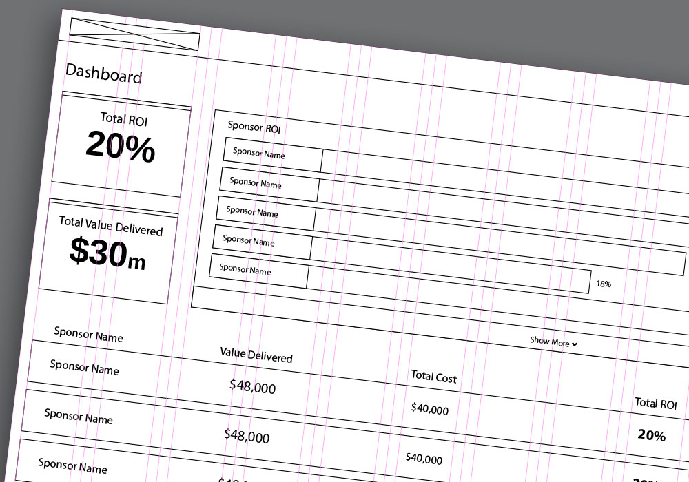
The first thing I started with was trying to understand not only what the primary value that B6A delivered to the client, but also the motivating factors for the various client types. This involved creating personas and reviewing customer data.

Devising a plan
B6A had a particularly difficult hurdle to overcome; lots of data that needed to be simplified and easily digestible. I began playing around with gradually increasing the information so that the users weren’t overwhelmed. This worked out as call out blocks that made the most important metrics readily available, then putting them into context with a graph and eventually moving to raw data.
The solution
The gradual release of information was the key to creating an interface that allowed for easy access to data that was important and yet not overwhelming. A side navigation that was visible for top level users, but was hidden from lower level users, prevented them from accessing info that they didn’t have permissions to see, and kept the experience seamless for all users.